You can have the right keywords, persuasive ad copy and a strong click-through rate and still watch your PPC budget disappear without enough enquiries.
People are clicking, but something breaks after they reach the website. The message feels different; the form asks too much, or the next step is unclear.
A high-converting landing page closes that gap. This PPC landing page checklist reviews the complete experience, from message matching and copy to mobile usability, tracking and lead quality.
What Is a PPC Landing Page?
A PPC landing page is created for visitors arriving through Google Search Ads, Meta Ads, LinkedIn Ads, display campaigns or remarketing.
Unlike a homepage, it is not meant to introduce every service. Its job is more focused: speak to one audience, present one offer, and encourage one primary action.
| Homepage | PPC Landing Page |
| Presents multiple services | Promotes one campaign-specific offer |
| Serves a broad audience | Targets a defined audience |
| Uses several CTAs | Prioritizes one conversion goal |
| Shares general information | Continues the ad’s message |
| Supports exploration | Focuses on conversion |
Why PPC Landing Pages Fail to Convert
Most landing pages fail because of several small points of friction. The headline does not match the ad, the offer is buried, the form feels like an application, or the mobile experience is frustrating.
These may seem minor to the business, but they create enough doubt to make a visitor leave.
High-Converting PPC Landing Page Checklist
1. Make Sure the Page Keeps the Ad’s Promise
Imagine clicking an ad for a free PPC audit and landing on a general digital marketing homepage. You would probably wonder whether you clicked the wrong link.
Your visitors react the same way. Keep the service, offer, audience and expected outcome consistent from ad to landing page. Strong message matches reassure visitors and support better Google Ads campaign performance.
2. Replace Generic Headlines with a Clear Benefit
“Grow Your Business with Us” sounds positive but says very little.
A stronger headline identifies the problem and the offer: “Reduce Your Google Ads Cost per Lead with a PPC Campaign Audit.”
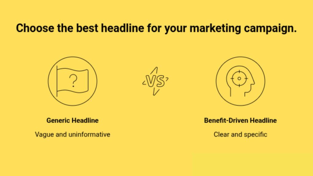
Do not make visitors decode clever wording. Tell them what is available and why it matters.
3. Make the Value Clear Before Visitors Scroll
The first screen should answer: “Why should I continue?”
Include a specific headline, a short supporting line, one key benefit, a relevant visual, a prominent CTA, and an immediate trust signal. Avoid long paragraphs and competing buttons.
4. Give the Page One Main Job
Asking visitors to book a call, download a guide, explore services and follow social profiles creates decision fatigue.
Choose one primary goal and repeat that CTA where needed. A focused goal also makes it easier to track campaign performance and understand which actions are driving meaningful results.
5. Write a CTA That Explains the Next Step
“Submit” does not tell visitors what they will receive.
Use specific wording such as:
- Request a Free PPC Audit
- Book Your Strategy Call
- Get a Custom Proposal
- Speak With a PPC Specialist
On longer pages, repeat the CTA after important sections.
6. Do Not Turn the Lead Form into Homework
A prospect may be ready to enquire, then change their mind when they see fifteen required fields.
Ask only for information needed to respond to or qualify for the lead. Fewer fields may increase submissions, while selected questions about budget, location, or timeline may improve quality. Aim for the least friction needed to collect a useful enquiry.
7. Translate Features into Outcomes
Businesses often describe what they do without explaining why it matters.
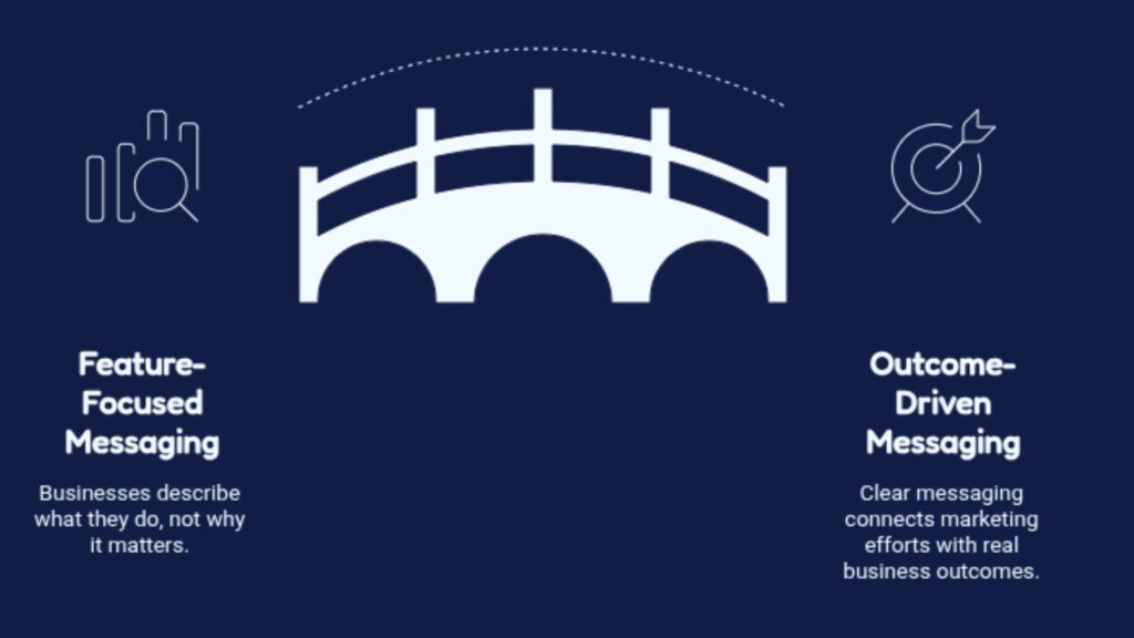
Feature: Advanced conversion tracking
Benefit: Identify which ads, keywords, and campaigns generate qualified leads and revenue.
Review each claim and ask, “What does this help the customer achieve?” This approach helps create clearer messaging that connects marketing efforts with real business outcomes.
8. Give Visitors a Reason to Trust You
Paid visitors may have never heard of your company.
Use genuine testimonials, verifiable case-study results, client logos, reviews, certifications, and clear privacy information. Avoid fabricated reviews or inflated claims. Trust comes from specific, believable proof.
9. Remove Anything That Competes with the Conversion
Full navigation, unrelated links, social icons, and pop-ups can pull visitors away from the intended journey.
Consider simplifying them while retaining essential footer links such as the privacy policy, terms and contact details. The aim is not to trap visitors; it is to make the promised next step easier to find.
10. Design for the Person Holding a Phone
A page may look polished on a laptop and still frustrating on mobile.
Check readable font sizes, thumb-friendly buttons, short forms, click-to-call and WhatsApp links, proper image scaling, comfortable spacing and fast loading. Test the entire journey on real devices.
11. Do Not Let a Slow Page Waste Paid Clicks
Every paid click has a cost. When visitors leave before the main content loads, that spend produces no opportunity.
Review oversized images, unused scripts, third-party tags, heavy videos, server response time, and layout shifts. Page Speed Insights and Lighthouse can identify issues, but prioritize a fast, stable experience over a perfect score.
12. Use Visuals That Help Visitors Decide
A generic stock photo may fill out space, but it rarely helps someone understand the offer.
Use product screenshots, dashboard previews, process diagrams, genuine team photos, comparison graphics, or case-study charts. Each visual should explain, demonstrate, or reassure. Compress images properly so they do not slow the page.
13. Answer the Questions Visitors Hesitate to Ask
Even interested prospects may worry about price, timelines, contracts, privacy, or implementation.
Use concise FAQs, clear processes, and transparent information to reduce uncertainty. Do not hide every important detail behind a contact form. Honest clarity is often more persuasive than exaggerated promises.
14. Track More Than Form Submissions
A campaign cannot be improved when the business only knows that “someone filled out the form.”
Track calls, WhatsApp clicks, bookings, purchases, demo requests and thank-you page visits. Connect Google Ads, GA4, Tag Manager and CRM data where appropriate. For successful lead generation, qualified opportunities matter more than simply increasing the number of submissions.
15. Use the Thank-You Page to Continue the Experience
The journey should not end with a blank “Form submitted” message.
A useful thank-you page confirms the action, explains what happens next, and gives an expected response time. It may also offer a calendar link, download, or direct contact option while supporting clearer tracking.
16. Test the Journey Before Paying for Traffic
Complete the full process as if you were the customer.
Click on each CTA, submit the form, test validation messages, call buttons, WhatsApp links, email notifications, CRM entries and conversion tags. Repeat the process on desktop and mobile. A broken form can quietly waste campaign spending.
17. Use A/B Testing to Settle Opinions
Landing-page decisions often become debates based on personal preference.
A/B testing replaces opinion with evidence. Test the headline, CTA, hero visual, form length, offer or testimonial placement. Where practical, test one major change at a time and wait for enough data. This approach helps businesses improve landing-page performance through continuous conversion rate optimization.
18. Judge the Page by Lead Quality
A higher conversion rate is not always a better business result.
If most enquiries are irrelevant, the extra conversions have little value. Review qualified lead rate, cost per qualified lead, appointment rate, sales conversion rate, customer acquisition cost and revenue. Landing-page optimization should improve commercial outcomes, not just dashboard numbers.
Quick PPC Landing Page Audit Table
Use this landing page audit checklist before launch and whenever performance changes.
| Element | Question to Check |
| Message match | Does the page continue with the promise made in the ad? |
| Headline | Is the main benefit immediately clear? |
| CTA | Is there one obvious primary action? |
| Form | Does it ask only for necessary information? |
| Trust | Is there genuine, relevant proof? |
| Mobile | Can visitors convert easily on a phone? |
| Speed | Does the page load quickly and remain stable? |
| Tracking | Are leads, calls, and sales recorded accurately? |
| Distractions | Are unnecessary links and pop-ups removed? |
| Testing | Are decisions based on reliable data? |
How Often Should You Audit a PPC Landing Page?
Audit the page before launching, after changing the ad or offer, and whenever cost per lead rises, conversion rate falls or lead quality declines. Recheck it after website, form or tracking updates.
Monthly reviews can uncover technical problems, while quarterly reviews can address broader changes in audience behavior and strategy.
Final Thoughts
A PPC campaign fails with clicks alone; it succeeds when those clicks turn into valuable customer actions.
Your landing page plays a crucial role in converting paid traffic into qualified leads. By improving clarity, trust, usability, and tracking, businesses can make better use of their advertising investment.
If your PPC campaigns are generating traffic but not enough enquiries, Gateway Marketing Digital, a designrush verified PPC agency, can help optimize your campaigns, landing pages and conversion journeys to improve performance and ROI.
Request a PPC landing page audit today and contact our team to identify opportunities to convert more visitors into customers.